Side by Side Comparison Bar Chart Builder

Compare diverse datasets easily, make informed decisions, and engage your audience with striking, easy-to-understand visuals. Ideal for business, academic, or personal use.


Did you love the function? Bookmark This Page for easy access next time.


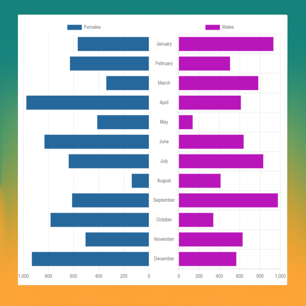
Our ‘Side by Side Comparison Bar Chart’ service helps you show two sets of data next to each other. You can use this to compare things easily. For example, if you want to show how many boys and girls are in each month of the year, or how many products you sold this year compared to last year, this tool can help.

You just need to put your data into the tool, and it will make two bar charts for you. These charts will be next to each other, so you can see the differences between the two sets of data clearly. This tool is good for anyone who needs to compare two sets of numbers or amounts. It’s easy to use and understand, so you can start comparing your data right away

Instant-Interactive Math Graph Generator

Simply enter any math formula and -x to x limits and instantly get downloadable graph chart. Math formula graph builder
For usage read the usage section below:


Did you love the function? Bookmark This Page for easy access next time.


This service is a tool to make a chart from any basic math formula. You can write multiple formulas in a one chart, each on a new line.
For example, if you want to see the line for “xx”, you write “xx” in the formula box. You can also write other formulas like “xxx”, “sin(x)”, and more. There are two kinds of charts you can choose from. One is ‘line’ and the other is ‘area’. ‘Line’ will make lines for each formula. ‘Area’ will fill in the space under the lines. You need to tell the tool what are the smallest and largest ‘x’ values. These values decide how wide the chart is.
This tool will make a chart that helps you understand the formulas better.

Usage

  • Linear Function: A linear function can be represented as y = mx + b where m is the slope of the line and b is the y-intercept. To graph a line with a slope of 2 and a y-intercept of 1, enter 2*x + 1 into the text area.
  • Quadratic Function: A quadratic function has the form y = ax² + bx + c. For example, to plot the function y = x² - 5x + 6, enter x^2 - 5*x + 6.
  • Cubic Function: A cubic function is of the form y = ax³ + bx² + cx + d. For instance, to plot the function y = 2x³ - x² + 3x - 1, enter 2*x^3 - x^2 + 3*x - 1.
  • Exponential Function: An exponential function can be written as y = a*b^x. For example, to plot y = 2*3^x, enter 2*3^x.
  • Logarithmic Function: A logarithmic function has the form y = a * log(b) (x). For instance, to plot y = log(2) (x), enter log(x, 2).
  • Sine and Cosine Functions: To plot sine and cosine functions, enter sin(x) or cos(x) respectively. For their variations such as amplitude or phase shift changes, adjust the formula accordingly. For example, for a sine wave with amplitude 2 and a phase shift of π/2, enter 2*sin(x + pi/2).

Remember, each formula should be on its own line in the text area. This way, you can graph multiple formulas at once. Just press “Enter” to create a new line for each formula. Be sure to replace any multiplication symbols with * and division symbols with /.

Please note that the ‘x’ in the formulas is case sensitive and should be in lowercase.

You may want to try these instant chart/graph builders:

Side by Side Comparison Bar Chart Builder

Instant-Interactive Math Graph Generator

List to bubble chart generator

CSV to Chart Online

Text List to Chart

List to bubble chart generator

Usage: x axis, y axis, radius of a buble


Chart will appear here


Did you love the function? Bookmark This Page for easy access next time.


The List to Bubble Chart Generator tool is an online service that lets you transform simple lists into engaging, informative bubble charts. A bubble chart might be useful in many instances – for instance, if you want to compare different data sets and see the relations between them.

In the case of the default example given, “TV Sales” and “Smartphone Sales”, you can input data for each category, specifying the x axis-coordinate, y axis-coordinate, and radius(size) of each bubble (representing a particular data point). Each line in the list represents a different bubble, with the category specified at the start.

The tool reads the data from your list, recognizes the different categories and their values, and converts this information into a visually intuitive bubble chart. Each category is presented with a different color for easy differentiation, colors are chosen randomly.
The x-coordinate and y-coordinate values position the bubbles on the chart, and the radius determines the size of each bubble. The larger the radius, the larger the bubble.

No technical skills or coding knowledge are required. And everything runs inside your browser, no any data exchange with external server.
You just need to enter the data in the correct format, and our tool will handle the rest instantly.
It’s a straightforward, practical way to generate informative charts from your data lists. Once the chart is generated, you can easily download it for use in reports, presentations, or simply to better visualize and understand your data.

You may want to try these instant chart/graph builders:

Side by Side Comparison Bar Chart Builder

Instant-Interactive Math Graph Generator

List to bubble chart generator

CSV to Chart Online

Text List to Chart